Cotton and Canvas: The Graphic Artists Stitching British Music's Visual Soul Into Every Tour Tee
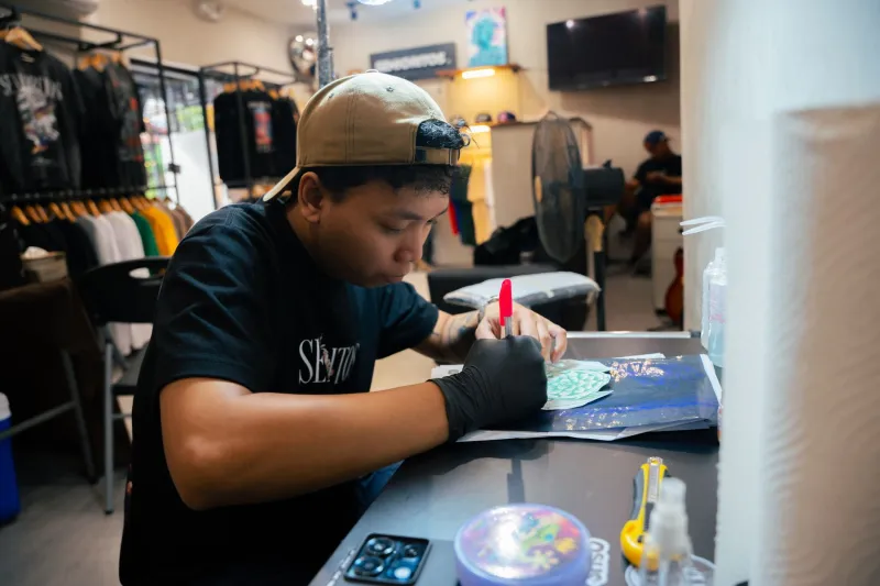
More Than a T-Shirt
Let's start with something that sounds obvious but rarely gets said plainly: band merchandise is art. Not in the vague, everything-is-art sense, but in the specific sense that it involves creative decisions, technical skill, cultural literacy, and a genuine attempt to communicate something true about a musical act's identity. The person who designed that Joy Division sleeve-inspired hoodie you've worn to pieces, or the tour tee from that Glastonbury set you'll never forget — they made choices that mattered.
Yet the people making those choices are almost entirely absent from any serious conversation about British music culture. They don't get interviewed. Their names don't appear on the merchandise they create. They exist in a peculiar professional space where the work is everywhere and the workers are nowhere.
The Brief That Isn't Really a Brief
Anyone who's done design work for musicians will recognise the particular challenge of the merch brief. It often arrives as something like: 'We want it to feel heavy but also kind of ethereal? Like, dark but not goth. Think the moors, but make it contemporary.' Or, alternatively, nothing at all — just a mood board of unrelated images and a deadline that's already passed.
Translating musical identity into visual language is genuinely difficult work. It requires the designer to listen — really listen — to what an artist is doing, what they're trying to say, and where they sit in the cultural landscape. The best merch designs feel inevitable in retrospect, as though they couldn't have looked any other way. Getting to that inevitability usually involves a considerable amount of iteration, a lot of rejected concepts, and the kind of creative sensitivity that doesn't always get acknowledged as a professional skill.
For touring merchandise specifically, there are additional constraints. The design needs to work on multiple garments and formats. It needs to be reproducible in screen print without losing its integrity. It needs to look good under the slightly chaotic conditions of a venue merch table, competing for attention with everything else on offer. And it needs to feel worth the price — because fans who spend thirty-five pounds on a tour hoodie are making a statement about their relationship to an artist, and the design is part of what they're investing in.
The Economics of the Merch Table
For many independent British acts, merchandise isn't a supplement to touring income — it's a significant portion of what makes touring financially viable at all. Streaming royalties are notoriously thin. Ticket sales, particularly for mid-level acts playing venues of a few hundred to a couple of thousand capacity, often barely cover costs after venue hire, production, and crew fees. Merch is where the margin lives.
That reality puts considerable pressure on the design. A poorly conceived or badly executed range can sit unsold through an entire tour. A design that resonates — that feels genuinely connected to the moment, to the album, to what the audience loves about the artist — can sell out in the first three nights and require emergency restocking.
Designers who work regularly with touring acts understand this pressure, and many of them have developed an instinct for what sells alongside what's artistically strong. The two aren't always the same thing, and navigating that tension is part of the skill. A design that's conceptually interesting but impenetrable to a casual fan at eleven o'clock at night after two hours of live music isn't going to shift units. A design that's immediately legible but aesthetically thin isn't going to satisfy the hardcore collectors who'll buy everything in the range.
Visual Historians, Unacknowledged
Here's a thought worth sitting with: if you wanted to trace the visual history of British independent music over the past thirty years, you could do it almost entirely through tour merchandise. The aesthetics shift with the times — the hand-drawn typography of the early nineties, the maximalist collage work of the mid-2000s, the stark minimalism that followed, the current revival of psychedelic illustration and risograph printing. Each era has its visual signatures, and those signatures were created by specific people making specific decisions.
Those people are, collectively, one of the more interesting creative communities in British music — and one of the least documented. There are no major retrospectives of merch design. No critical framework for discussing what makes a tour tee great. No institutional acknowledgement that this is a body of work worth preserving or celebrating.
Some of the designers working in this space have begun to push back against that invisibility — signing their work, building public profiles, exhibiting prints as standalone art objects. There's a growing collector market for original merch artwork and limited-edition prints, which has given some designers a platform they hadn't previously had. But it remains a slow process of recognition for a field that's been invisible for decades.
The Relationship That Makes It Work
The best merch design tends to emerge from genuine creative relationships between designers and artists — situations where there's enough trust and communication for the designer to understand not just what the artist wants to project, but what they're actually about. Some of those relationships last years, with a designer becoming a consistent visual collaborator across multiple releases and tours.
Those long-term partnerships produce the most coherent visual identities — the sense that a band's aesthetic is a living, evolving thing rather than a series of disconnected one-off projects. For fans, that coherence matters. It deepens the sense of a band as a complete creative entity, not just a source of songs.
For the designers involved, these relationships are often the most professionally satisfying part of the work — the chance to contribute to something larger than any individual piece, to be genuinely part of an artist's creative story even if that contribution remains largely unacknowledged.
Worth More Than the Cotton
British music has always had a remarkable relationship with visual culture. From the sleeve art of the sixties through the era of iconic music video aesthetics and on into the present, the visual dimension of how music gets presented has been taken seriously in ways that aren't always true elsewhere. Merch design is part of that tradition — perhaps the most democratic part of it, the art form that ends up in the washing machine and gets worn to the pub.
The people making it deserve a bit more credit than they've historically received. Next time you pull on that tour tee, spare a thought for whoever spent three weeks getting the typography right.